

Call to action (CTAs) is essential for boosting conversions and engagement. When crafting CTAs, it's important to consider their visibility, message clarity, and relevance to your target audience. By following practices in CTA design, testing, and performance analysis, marketers can develop strategies that resonate with their audience while achieving desired results. This article explores call to action examples. Provides insights on leveraging them to maximize their impact on the success of your business.
At Sociallyin, our goal on a regular basis is to increase sales, downloads, clicks, engagements, follows...all of the wonderful things that often lead to an increased ROI and more money in our clients pockets.
However, the only way to see the increased results you’re hoping for is to embrace a call to action. Or, more specifically, find call to action examples you can spin and use for epic results.
SUMMARY
- What is a Call to Action?
- The Different Types of Call to Action Examples and How to Use Them Successfully
- How Can You Tell a Good Call to Action From a Bad One?
- How to Write an Effective Call to Action
- How a Landing Page Can Damage Call to Action Results
- 55 Call to Action Examples: The Complete List
- Call to Action Copy: Utilizing Action Words and Verbs
- 5 Best Practices for Designing Call to Action
- Frequently Asked Questions
What is a Call to Action?
A call to action, commonly known as a “CTA” is a short, engaging phrase that is utilized by marketing and sales professionals to propel readers and potential customers towards a particular goal. They come in all shapes and sizes, from a simple “click” or “buy now!” to longer phrases like “Click down below to learn more!” or “Shop now and see the difference!”
The Different Types of Call to Action Examples and How to Use Them Successfully
CTAs, called Calls to Action, play a role in marketing strategies. These powerful tools can drive user engagement. Increase conversion rates for your business. By comprehending the types of CTAs and knowing how to implement them, you can successfully enhance your overall marketing efforts. In this article, we delve into types of CTAs. Offer guidance on their optimal utilization.
1. Direct Call to Action
Direct CTAs are instructions that guide users on what actions they should take. They are commonly employed to stimulate sales, encourage sign-ups, or achieve outcomes.
Here are a few direct call to action examples:
- "Buy Now"
- "Sign Up"
- "Download eBook"
For the use of direct call to action (CTAs), make sure that:
- Your message is clear and concise.
- The CTA button or link is visually appealing and easy to find on the page.
2. Persuasive Call to Action
Unlike persuasive CTAs, subtle language encourages users to take action. They often highlight the benefits or value associated with an action. Here are some persuasive call to action examples:
- "Discover More"
- "Get Started"
- "Learn How"
To effectively utilize persuasive CTAs, consider these tips:
- Create a sense of urgency.
- Mention the benefits users can expect from taking the desired action.
3. Social Sharing Call to Action
Social sharing call to action to share content or products on social media platforms. Commonly used to encourage sharing include:
- "Tweet This"
- "Share on Facebook"
- "Pin It"
To optimize the impact of social sharing call to action, follow these suggestions;
- Place the call to action near the content you want people to share.
- Make sharing effortless by providing a user-friendly interface requiring just a click or two.
4. Information Seeking Call to Action
When websites encourage users to provide their contact details in exchange for information or services, it is called an information-gathering Call to Action (CTA). Examples of CTAs are:
- "Subscribe to Our Newsletter"
- "Get a Free Quote"
- "Request a Demo"
To ensure successful implementation of information-gathering CTAs:
- Communicate the value users will receive in return for their information.
- Keep form fields to minimize obstacles and encourage completion.
5. Navigational Call to Action
Navigational call to action guide users toward finding information. Examples include:
- "View Our Portfolio"
- "Read More About Our Services"
- "Explore Our Blog"
To make use of this call to action:
- Place them strategically near relevant content.
- Ensure they direct users to related information.
A clear understanding of the different types of CTAs, their purposes, and how to implement them effectively can significantly improve the user experience and lead to favorable outcomes for your business. By employing these strategies, you can create marketing campaigns that are more engaging and effective, resulting in results.

How Can You Tell a Good Call to Action From a Bad One?
Now you’re probably wondering, if a call to action is so easy to write, how are there still good or bad ones? And more importantly, how will I know if I’ve written a GOOD one?
The very best call to action examples are those that have won over prospective buyers quickly and efficiently.
They’re usually exciting and creatively compelling in such a way that a buyer doesn’t even realize they’re being coerced.
If your call to action phrases threatens a visitor or reader in some way or doesn’t deliver a certain amount of excitement, you probably won’t see very good results.
Your call-to-action must serve a very specific purpose. And more importantly, it must capture your audience and lead them into their buying decision by eliminating friction.
If your CTA doesn’t cause excitement or eliminate friction, it’s not worth the time it takes to paste it on an ad. And more importantly, it’s not worth the money and time lost once the ad itself is published.
Call to Action Examples: The Must-Have Elements
There are obviously countless ways you can write and execute a call to action. And while your products and copy leading up to your call to action are of vital importance, in the end, your call-to-action is the decision maker and thus requires special attention.
As a social media company, we’ve done a mass amount of research into the effectiveness of call-to-actions, including what makes them so effective, what makes them less effective, how the copy itself impacts the results and much more.
However, we found several interesting concepts that DID reshape our thinking in some areas and definitely want to bring those to light here.
 How to Write an Effective Call to Action
- Clear and Compelling
- Use Action-Oriented Verbs
- Make It Relevant and Valuable
- Create a Sense of Urgency
- Prioritize Visibility
- Test, Measure, and Improve
Encouraging your audience to take immediate action is crucial in marketing. This is where the Call to Action (CTA) element comes into play. The effectiveness of your call-to-action (CTA) determines the success of your marketing campaigns. Here are some steps to help you write a CTA.
- Clear and Compelling
Your CTA should be clear and captivating enough to grab your audience's attention. Make it intriguing while maintaining clarity about what you're offering. Avoid using vague CTAs that could confuse your audience and reduce response rates.
- Use Action-Oriented Verbs
Remember, a CTA is about prompting action. Incorporate intense action verbs such as 'Buy now,' 'Download,' 'Subscribe,' etc., which can create a sense of urgency in your audience and motivate them to take action.
- Make It Relevant and Valuable
Make sure that your CTA aligns with the content it accompanies. It should provide value to your audience by offering something beneficial.
For instance, if your content focuses on fitness tips, you can entice your audience with a call to action (CTA) like 'Get Your Free Fitness Guide Today' to provide them with a resource.
- Create a Sense of Urgency
Craft your CTA in a way that instills a sense of urgency. Phrases such as 'Limited Time Offer' or 'Act now before it's too late' can create the perception that they might miss out on an opportunity if they don't take action.
- Prioritize Visibility
Ensure that your CTA stands out and is easy to locate. Consider using contrasting colors for your CTA buttons and placing them strategically in areas of your webpage.
- Test, Measure, and Improve
Regularly track the performance of your CTAs by measuring through rates, conversion rates, and other relevant metrics. Continuously conduct A/B tests with versions of your CTAs to determine which resonates best with your audience and use those insights to improve.
Remember, there isn't a one-size-fits-all approach when it comes to crafting a CTA. Keep experimenting until you discover what works best for your brand and target audience.
How a Landing Page Can Damage Call to Action Results
Even the best call-to-action examples can’t reverse the damage that a poorly written and designed landing page can wreak on your ad campaigns.
If you want to make the most out of our incredible call to action phrases for your marketing campaigns, it’s imperative that you not make the following mistakes on your landing page.
#1 Asking for Too Much Information Too Soon
Classic mistake. You don’t provide enough information and then demand too much from your visitors.
A quick way to fix this: limit the information you ask for, (the less information you require, the less friction there will be through the process) and provide sufficient information about your brand to build trust with your audience on all fronts of the buying process.
#2 Your CTA Doesn’t Stand Out
We love this one because it doesn’t seem like it should be THAT big of a deal, but it is.
If your call-to-action is the same color as your background or blends too easily, it adds friction.
The fix? Make your call to action CTA the opposite color of your landing page background to draw attention to it. Bright colors work wonders.
#3 The Call-to-Action Link VS Call to Action Buttons
Did you know that call to action buttons perform 28% better than call-to-action links?
Now you know. 😏😉
#4 The Generic Route
“Submit” or “Fill out the form below”...you’ve seen it everywhere.
But did you know that personalizing your call-to-action can results in 202% performance increase?
The goal is to invoke more action and excitement around your “demands” and the best way to do this is to get creative and tailor every CTA. 👆
#5 When in Doubt, Always A/B Test
If you want to create the best possible call-to-actions, whether you’re going to use one of our call-to-action examples or not, always, always A/B test.
It will allow you to pinpoint the specific ways that customers are 1) interacting with your CTAs and 2) how you can update them for bigger and better results over time.
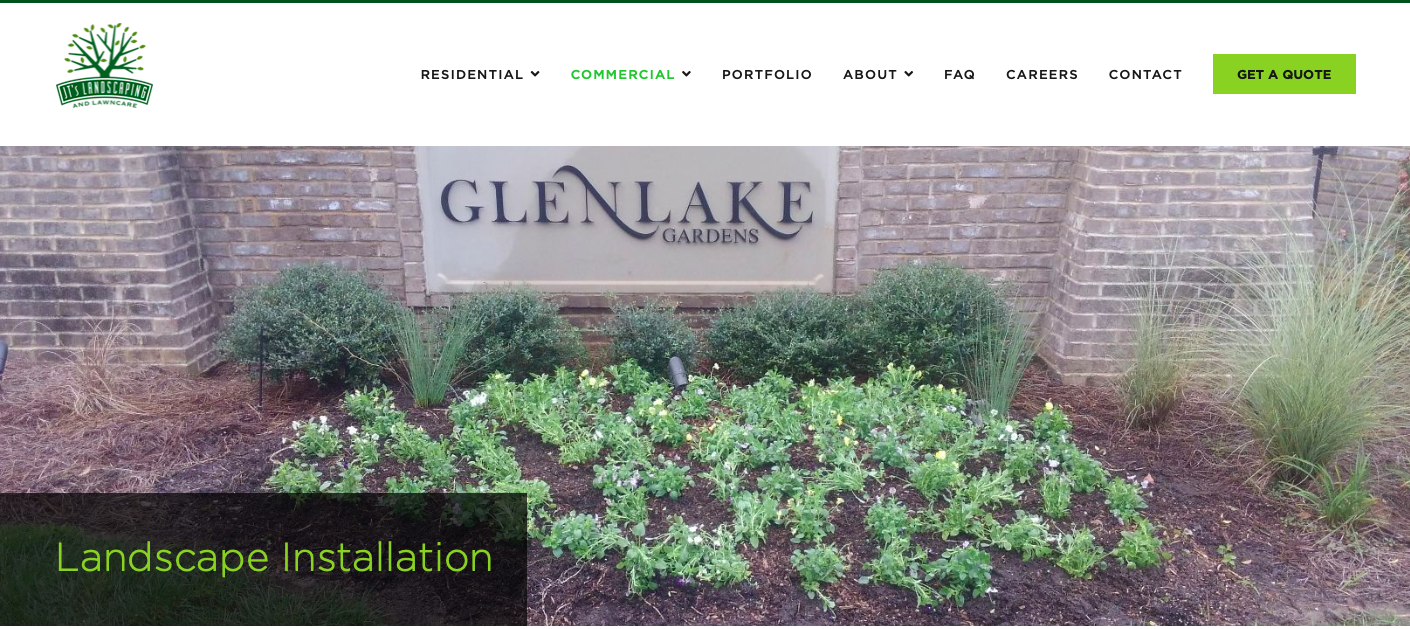
55 Call to Action Examples: The Complete List
We’ve been through all of the whats, whens and hows, which means it’s time to start nailing down every incredible CTA button we’ve ever seen. Ready?

Call to Action Example #1: Get My Free Proposal
Klient Boost
It’s all here. Pitch, opposite background colors and a concise message.

Call to Action Example #2: Get Started
Regions
Adding “click triggers”, (which is what we call the short additional narrative under or above your CTA button) to your call-to-action can greatly increase the chances of a potential buyer taking a chance and taking a click.

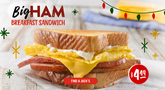
Call to Action Example #3: Find a Store
Jacks
Colorful. Eye-Catching. Doesn’t ask for too much information.
Call to Action Example #4: Shop Best Sellers
Lume Deodorant

Call to Action Example #5: Book Appointment
Renovoendo
This is a call-to-action example on the simpler side, for sure. However, it’s to the point and because of the way they’ve layered colors, it works.

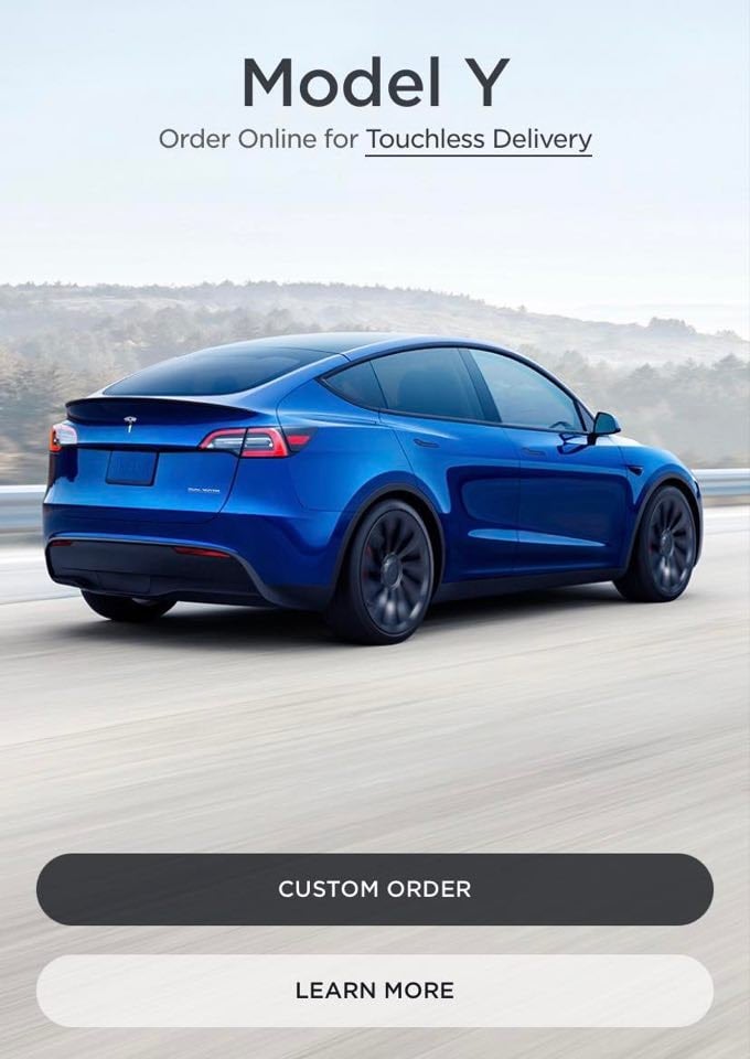
Call to Action Example #6: Custom Order
Tesla
Call to Action Example #7: Shop Now!
Sephora
The ultimate way to drive sales: woo your customers with incredible deals. 😍

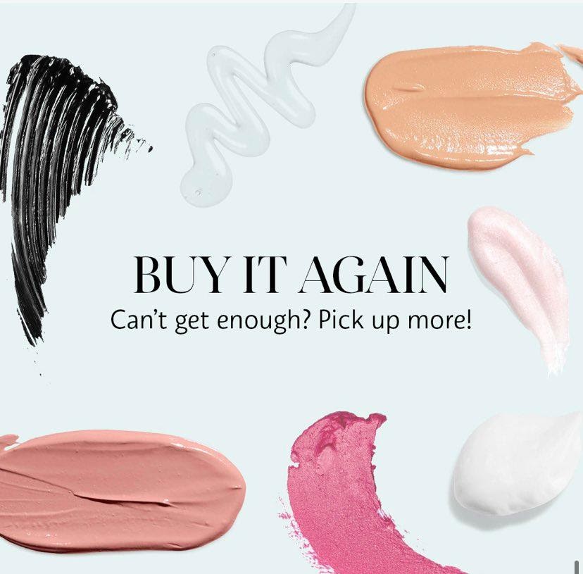
Call to Action Example #8: Buy it Again!
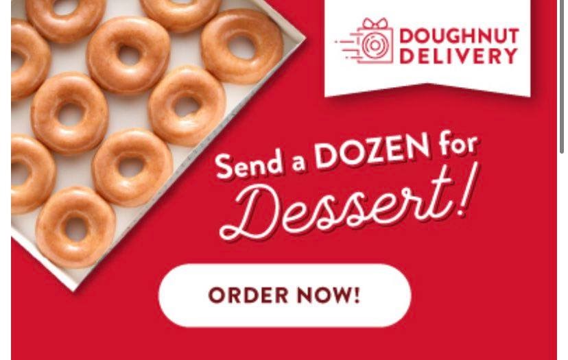
Call to Action Example #9: Order Now!
Krispy Kreme
KK has used a brilliant scheme here. Not only are they promoting the idea of a delivery for the reader, but also for friends and family! Talk about two for the price of one.
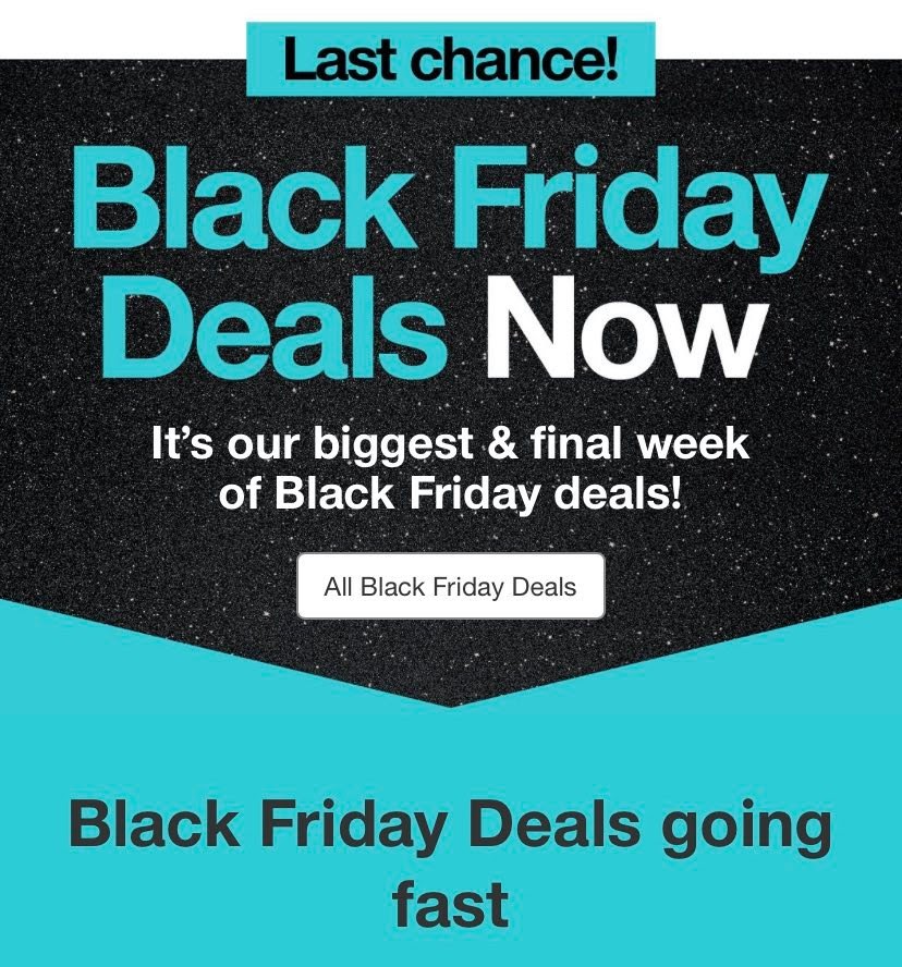
Call to Action Example #10: All Black Friday Deals
Target
This CTA button is especially eye-catching. Bright, contrasted colors, sparkling backgrounds...doesn’t get better than this aesthetically.
In addition, they’re pulling people in by reminding them that deals and merchandise are going FAST and they need to shop sooner rather than later to save BIG.
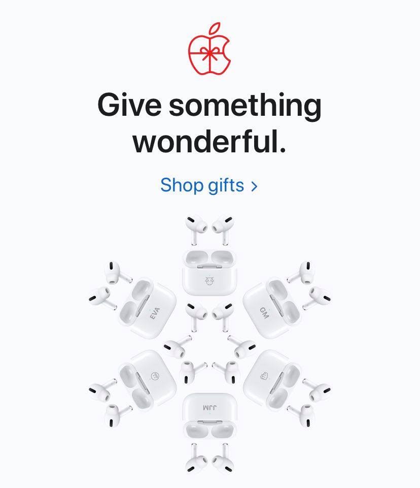
Example of a great call to action #11: Shop gifts. 💞
Apple
Slee and eye-catching. But when is apple not? ;)

Copy-Worthy Call to Action Example #12: See details!
Bed, Bath and BEYOND
There’s several reasons why I love this one. For one thing, it’s colorful, engaging and draws attention to the fact that it’s a LIMITED TIME deal, which means customers need to act quickly. But I also love the fact that it’s an incentive to spend more throughout their shop.
Call to Action Example #13: Learn more!
Samsung
The copy. The contrast. It’s all perfect, in our humble opinions.

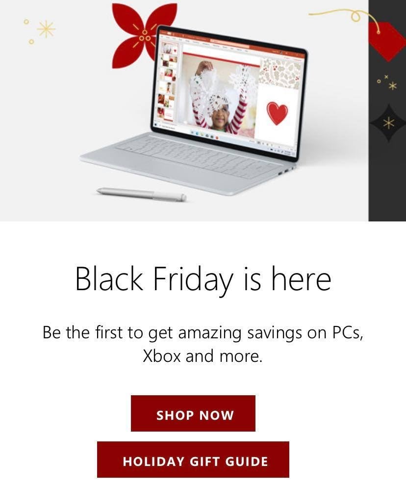
Call to Action Example for the books #14: Holiday Gift Guide (Genius, really.)
Microsoft
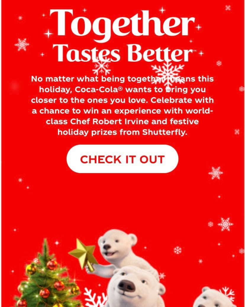
Call to Action Copy-Cat Alert #15: Check it Out!
Coca-Cola
The most enchanting part of this incredible CTA button? The drifting snowflakes, the contrast, the color, the message.
Okay, you’ve got us. The whole thing.
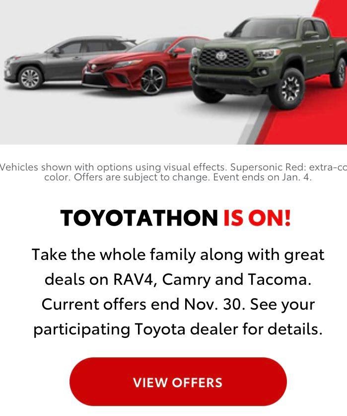
Call to Action Example #16: View Offers
Toyota
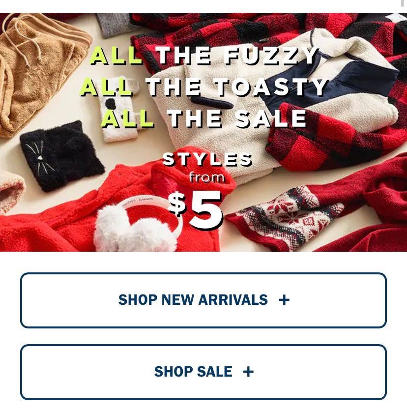
Call to Action or the books #17: Shop Sale+Shop New Arrivals
Old Navy
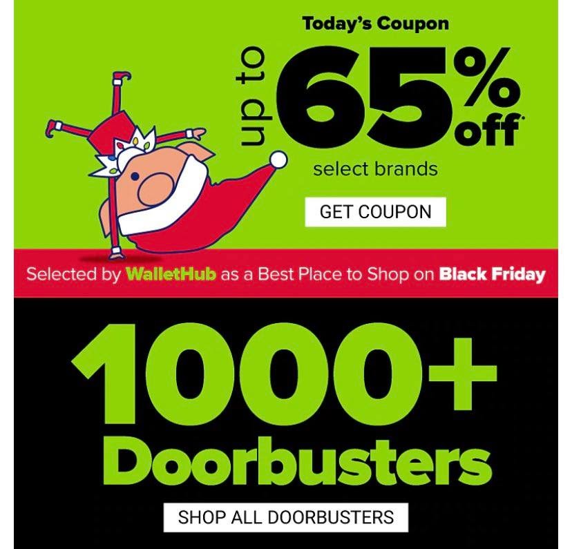
Call to Action Example #18: Get Coupon and Shop All
Belk
This will quite possibly take the cake for the most fun and enticing CTA.
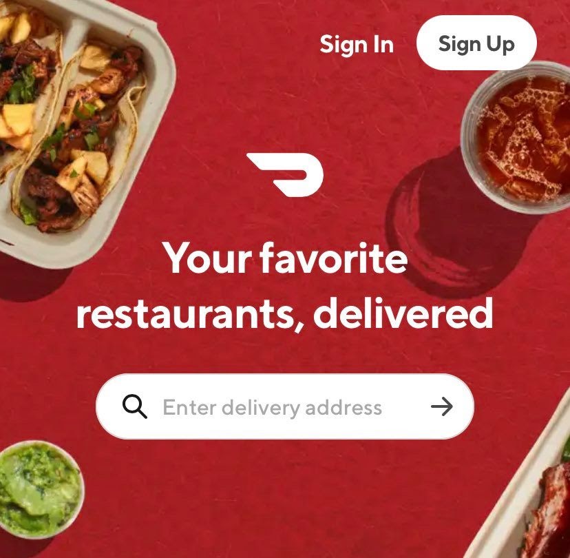
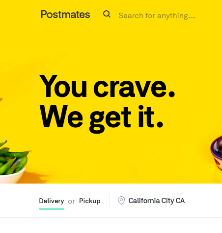
Call to Action Example #19: Enter Delivery Address.
DoorDash
This one is fabulous, not only because of the contrast, but also because it doesn’t ask for an insane amount of information. All you have to do is enter your address to get started.
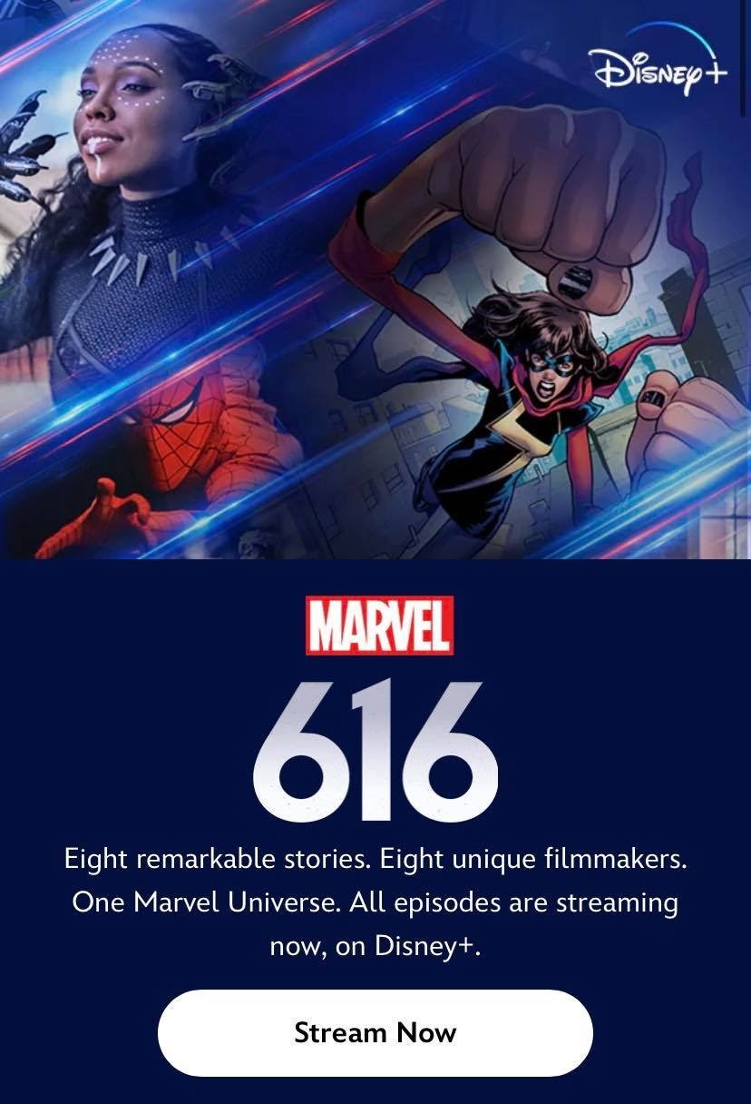
Call to Action Example #20: Stream Now
Marvel
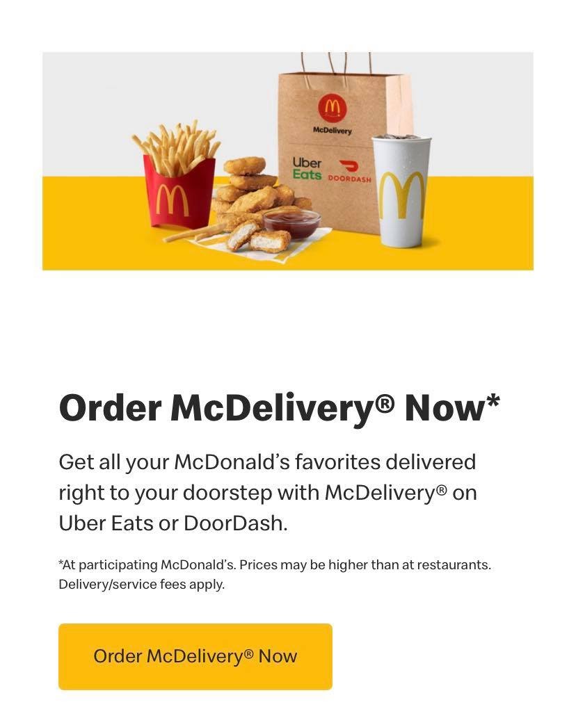
Call to Action Example #21: Small customizations: Order McDelivery Now!
McDonalds
When in doubt, customizing your CTA can significantly increase your rate of conversion. And right here, McDonalds nailed it.
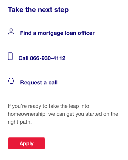
Call to Action Example #22: Small customizations: Apply / Apply Now
Call to Action Example #23: Book Now
Call to Action Example #24: Contact Us
Call to Action Example #25: Download
Call to Action Example #26: Learn More
Call to Action Example #26: Learn More

Call to Action Example #27: Visit Website

Call to Action Example #27: Shop Now
Call to Action Example #28: Sign Up

Call to Action Example #29: Get A Quote
Call to Action Example #30: Subscribe

Call to Action Example #31: Delivery
Call to Action Example #32: Shop Sale
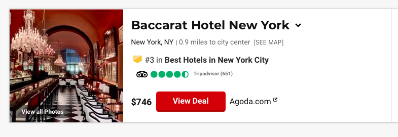
Call to Action Example #33: View Deal
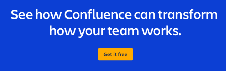
Call to Action Example #34: Get it Free
Call to Action Example #35: Start Streaming

Call to Action Example #36: Order Now

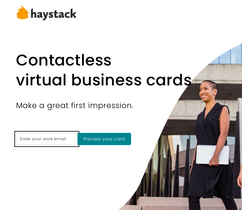
Call to Action Example #37: Preview Your Card
Call to Action Example #37: Get Your Coupon

Call to Action Example #38: Shop New Arrivals

Call to Action Example #39: View All Offers

Call to Action Example #49: Shop Now

Call to Action Example #50: Gift Guide

Call to Action Example #51: Shop Best Sellers

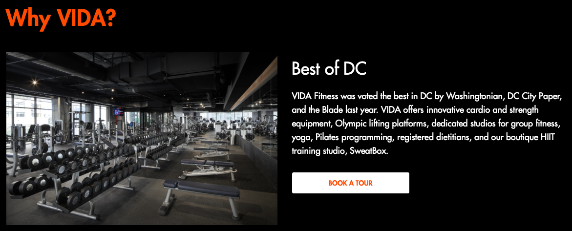
Call to Action Example #52: Book A Tour
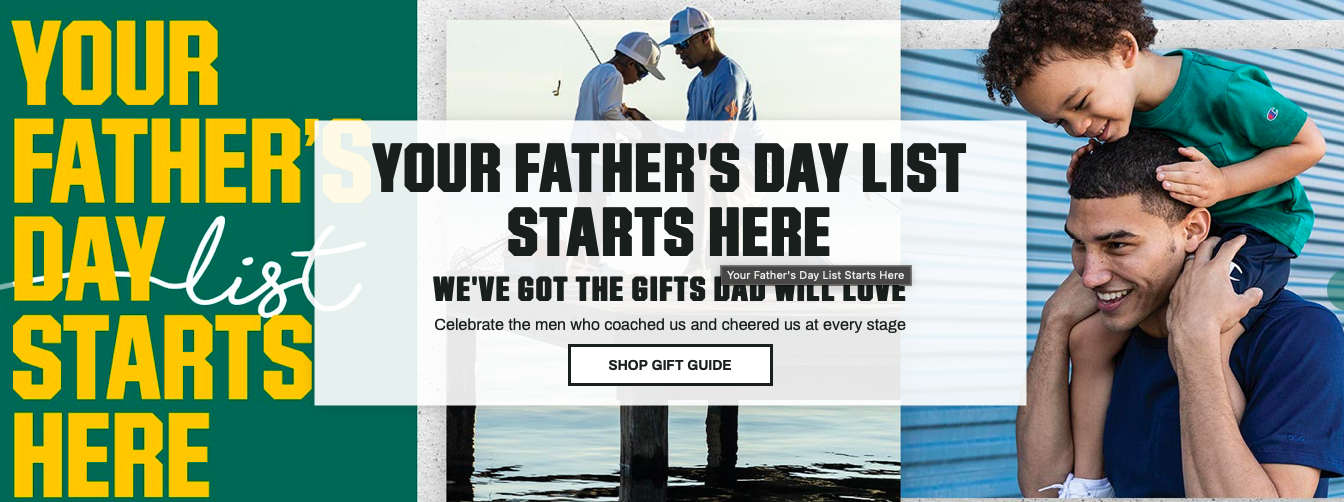
Call to Action Example #53: Shop Gift Guide
Call to Action Example #54: Get The App

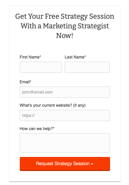
Call to Action Example #55: Request Strategy Session
Call to Action Copy: Utilizing Action Words and Verbs
When it comes to crafting a great call to action, it’s important to drive your audience to take action and increase conversions. You can do this by implementing power words and verbs. Some excellent examples:
- Bargain
- Before
- Best
- Big
- Billion
- Bonanza
- Bonus
- Cash
- Cheap
- Deadline
- Discount
- Dollar
- Don’t miss out
- Double
- Economical
- Exclusive
- Expires
- Explode
- Extra
- Fast
- Feast
- Final
- First
- Fortune Frenzy
- Frugal
- Gift
- Giveaway
- Greatest
- Guilt-free
- Hurry
- Inexpensive
- Instantly
- Jackpot
- Last chance
- Limited
- Luxurious
- Marked down
- Massive
- Monetize
- Money
- More
- Nest egg
- Never again
- New
- Now
- Pay zero
- Premiere Price break
- Prize
- Profit
- Quadruple
- Quick
- Reduced
- Rich
- Running out
- Sale ends soon
- Save
- Savings
- Six-figure
- Skyrocket
- Soaring
- Special
- Surge
- Treasure
- Triple
- Ultimate
- Up-sell
- Value
- While they last
- Whopping
5 Best Practices for Designing Call to Action
- Use compelling text
- Make it visually stand out
- Position strategically
- Optimize for devices
- A/B Test and Iterate
To create Call To Action (CTAs) that drive conversions and yield results, it's crucial to follow certain design principles that have proven successful.
Here are some best practices for designing CTAs that you can incorporate into your strategy:
- Use compelling text:
-
- Create a persuasive message that emphasizes the value of what you're offering.
- Address the pain points of your users. Position the CTA as the solution.
- Start with action verbs like "Download," "Sign Up," "Learn More," etc.
- Avoid terms and instead be specific to create a sense of urgency and importance.
- Make it visually stand out:
-
- Use colors contrasting with the rest of the design to make the call-to-action (CTA) button stand out. This will help draw the user's attention and increase their chances of clicking the button.
- Consider color psychology to ensure your color choices align with your intended message.
- Ensure that the size of the CTA button is sufficient so users can easily click or tap on it.
- Position strategically:
-
- Choose a point where users are likely to notice the CTA.
- Place the CTA button above the fold so it's highly visible without scrolling.
- In long-form, content, incorporate CTAs throughout to provide engagement opportunities.
- Optimize for devices:
-
- Ensure that the CTA adapts well to screen sizes and resolutions on mobile devices.
- Consider touch input, making sure that the button is ergonomic for mobile users.
- Conduct tests on devices to ensure a user experience.
- A/B Test and Iterate:
-
- Regularly evaluate the performance of your CTAs. Make adjustments.
- Experiment with variables like button color, text, and placement to find the most effective combination.
- Leverage analytics to inform decisions and maximize conversion potential.
By implementing these practices for CTA design, you're well on your way to creating compelling, impactful, and visually appealing call-to-action elements that yield results. Consistency is vital, and continuous optimization is key for long-term success.
Frequently Asked Questions
What is the purpose of a call to action?
The primary purpose of a call to action is to guide customers or readers toward an action or response. This could include purchasing, subscribing to a newsletter, or sharing/referring content. Effective calls to action play a role in business practices and marketing strategies by increasing engagement, improving conversion rates, and contributing to overall campaign success.
Can a call to action be a question?
Absolutely! A call to action can indeed be presented as a question. Using a strategy can encourage the audience to think and engage interactively compared to just making a simple statement. This approach aims to response or stimulate behaviors, ultimately enhancing user participation. The objective is to elicit a reaction from the reader, fostering a connection with the content.
How many CTA should a page have?
Ideally, a page should have one CTA that serves a goal and provides clear direction for users. However, depending on the content and objectives of the page, it may be appropriate to include CTAs that complement the action without causing distractions or confusion. Striking a balance between CTAs is crucial to maintain user focus and achieve conversions.
How do you optimize CTA?
To optimize CTAs, it is recommended to follow these guidelines: First, utilize attention-grabbing and clear language that compels action. Secondly, ensure your design is visually appealing and stands out from the website's design. Thirdly, test placements, sizes, and shapes of your CTAs to determine the effective combination. Lastly, analyze your CTA performance using A/B testing and analytics tools. By optimizing your CTAs in this manner, you can increase user engagement. Improve conversion rates.
What is a good call-to-action rate?
The effectiveness of a call to action (CTA) can differ depending on the industry communication method, target audience, and the specific CTA being used. Generally, a 2-3% CTA rate is considered satisfactory in sectors. However, digital marketers usually aim for rates around 5%, indicating audience engagement and successful persuasive tactics. Understanding that achieving a CTA rate requires quality and quantity is essential.
Unleashing Your Business Potential with Sociallyin
Whenever you feel ready to witness a boost in your click-through rate, Sociallyin is here to offer our assistance. We are committed to increasing conversions and improving your presence. Here's how we can assist you;
Sociallyin keeps up to date with the changes in marketing, ensuring that your business stays ahead of the game. Our commitment goes beyond a one-time campaign. We support your growth by adjusting strategies to optimize your click-through rate consistently.
Let's collaborate to improve your visibility and boost your conversion rates. Are you excited to begin?


Your Comments :